In today’s mobile-first world, your website needs to look great and work flawlessly on every screen. Here’s what that really means—and how to check if you’re doing it right.
Understanding Mobile-Friendly Design
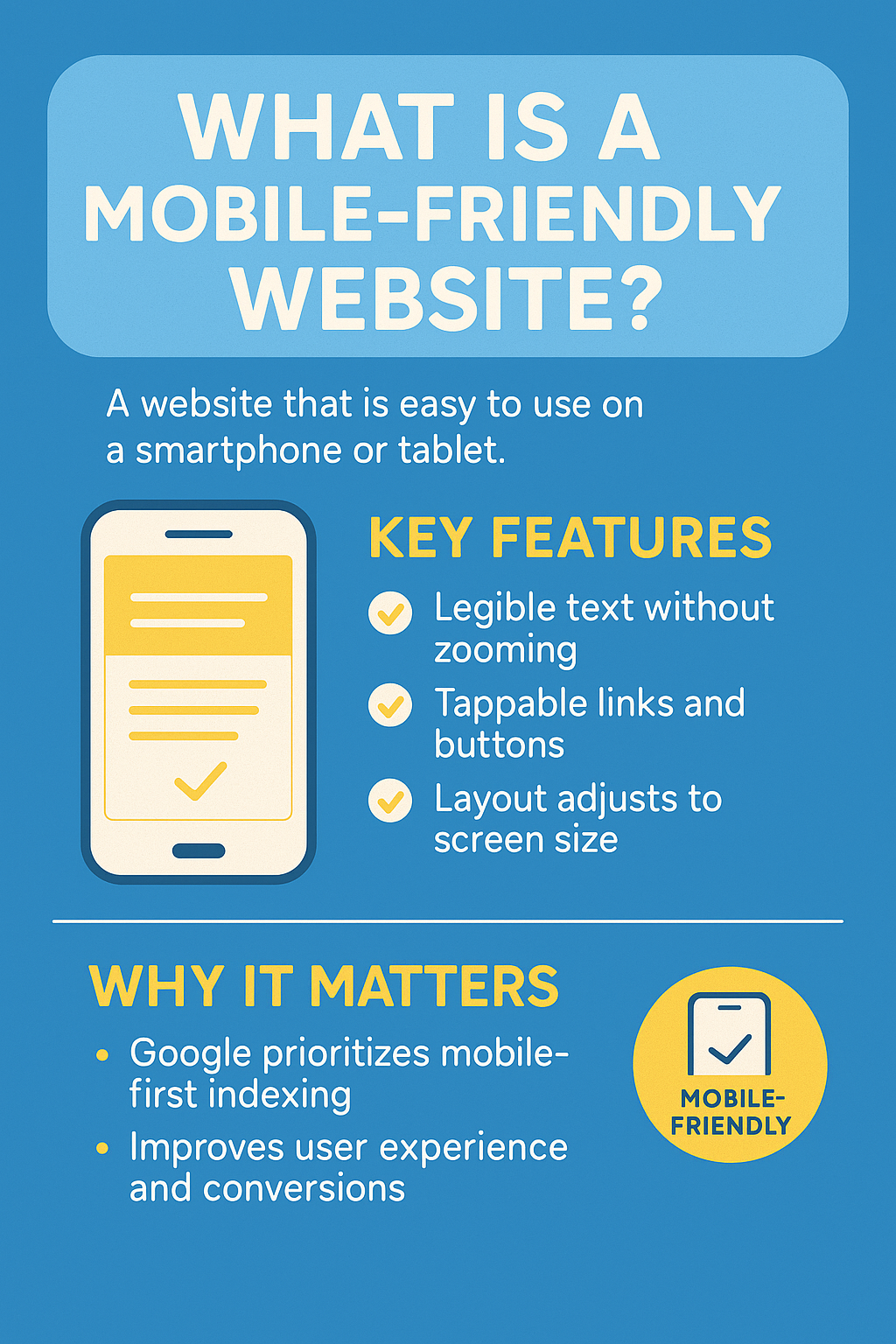
A mobile-friendly website is one that functions well on smartphones and tablets. It loads fast, displays content clearly, and requires no zooming or horizontal scrolling.
- ✅ Text adjusts for legibility on small screens
- ✅ Buttons and links are easy to tap
- ✅ The layout responds to different screen sizes
- ✅ No pinching, zooming, or horizontal scrolling needed
Why It Really Matters
Google now ranks your site based on how it performs on mobile. That’s not just a tech detail—it directly affects how many people discover you online.
But search engines aside, your visitors care too. If your site is slow, hard to use, or looks broken on a phone, chances are they’ll leave—and may never return.
Issues That Break the Mobile Experience
- ❌ Text that’s too small to read
- ❌ Buttons that are too close together
- ❌ Layouts that don’t fit the screen
- ❌ Pages that require horizontal scrolling
How to Check If Your Site Is Mobile-Friendly
The easiest way? Pick up your phone. Open your site and ask yourself:
- Is the text large enough to read comfortably?
- Are the buttons spaced well apart?
- Do images and sections align properly?
- Can I scroll smoothly without side-to-side swiping?
You can also use browser developer tools to simulate different devices or screen sizes right from your desktop.
Try rotating your phone too—landscape mode reveals problems many designers overlook.
Simple Ways to Improve Your Mobile Experience
Add a Viewport Meta Tag
<meta name="viewport" content="width=device-width, initial-scale=1.0">
This line of code ensures your site scales correctly on mobile devices.
Use a Responsive Layout
Use CSS Grid, Flexbox, or a responsive framework like Bootstrap to let your layout adjust automatically to different screen sizes.
Apply Media Queries
Media queries let you define styles that change based on screen width. For example:
@media (max-width: 768px) {
  body {
    font-size: 16px;
  }
}
Your Mobile Site Matters More Than Ever
Great design isn’t just about looks—it’s about access. Make sure your visitors can use your site wherever they are, on whatever device they choose.