
Make Your Website Look Great on Any Screen
Run a free mobile-friendly test and responsive design preview across phones, tablets, and desktops.
✅ No signup required ⚡ Instant results 🔍 SEO-optimized report
Test Your Website's Responsiveness
Loading...
Testing website responsiveness...
How to Run a Mobile-Friendly and Responsive Design Test
Step 1
Enter any website URL to start your responsive web design check.
Step 2
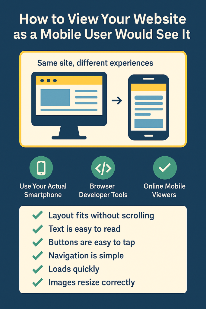
Choose a screen size or device type — mobile, tablet, or desktop — for layout preview.
Step 3
Instantly view your responsive score and get improvement tips with a shareable report.
Responsive Web Design Test Features
Responsive Score
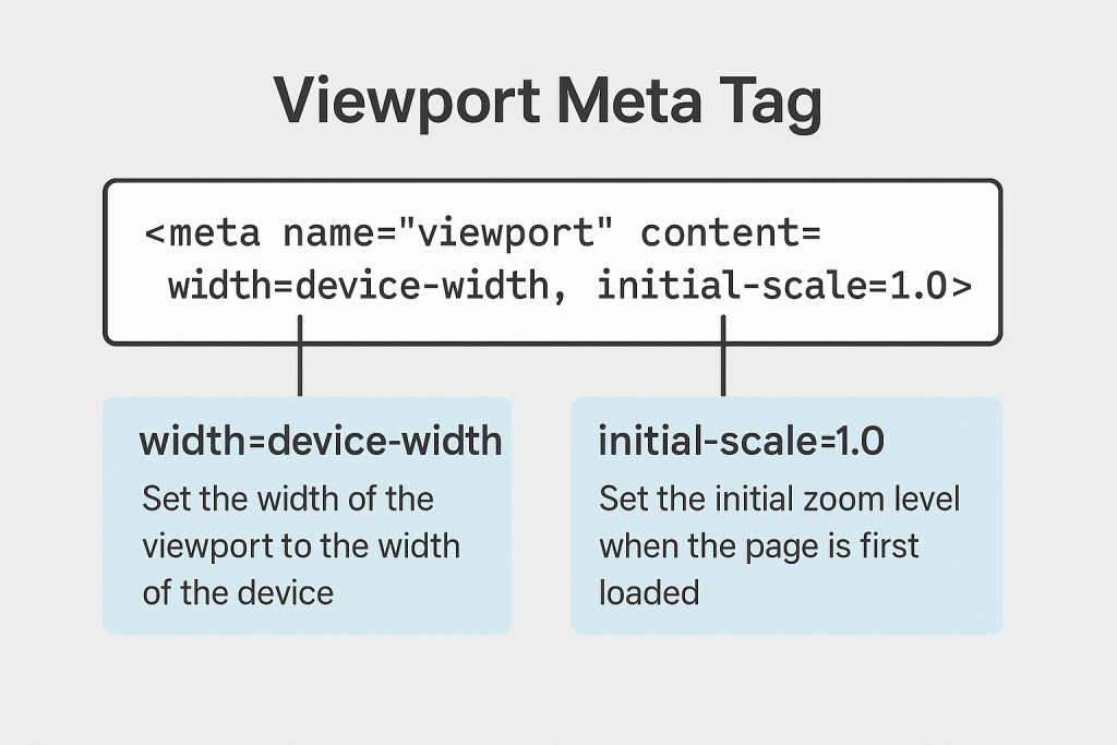
Viewport Meta Tag & CSS Checks
Mobile-Friendly Test Result
Public Shareable Report
Who Should Use Our Responsive Website Checker?
👨💻 Developers
Check your layout’s responsiveness on real device sizes — no emulators needed.
🎨 UI/UX Designers
Validate responsive layouts and visual design across screen sizes — instantly.
🏢 Agencies
Deliver mobile responsiveness as part of your client audit and design workflow.
📈 SEO Specialists
Run mobile-friendly SEO checks that impact page rankings and performance.

Frequently Asked Questions
Yes! ResponsiveWebTest.com is completely free to use for running responsive and mobile-friendly checks.
Absolutely. Just enter a public website URL and the responsive preview tool will render it in your chosen dimensions.
No, it replicates screen dimensions and viewport behavior but does not emulate the full mobile browser environment or user agent.
Yes, you can generate a public, shareable link to your test results and share it with clients, teammates, or stakeholders.
Indirectly, yes. Our mobile-friendly test checks factors like viewport configuration and layout responsiveness, which are considered by search engines like Google.