Mobile visitors make up the majority of web traffic — yet many websites still look broken on small screens. The reason? They’re missing one simple line of HTML.
Why So Many Websites Break on Mobile
Have you ever opened a site on your phone and had to zoom in just to read a headline? Or scroll sideways to finish reading a sentence?
That usually means the website is missing the viewport meta tag — a small but essential piece of HTML that tells browsers how to scale and render content on different screen sizes.
What Is the Viewport Meta Tag?
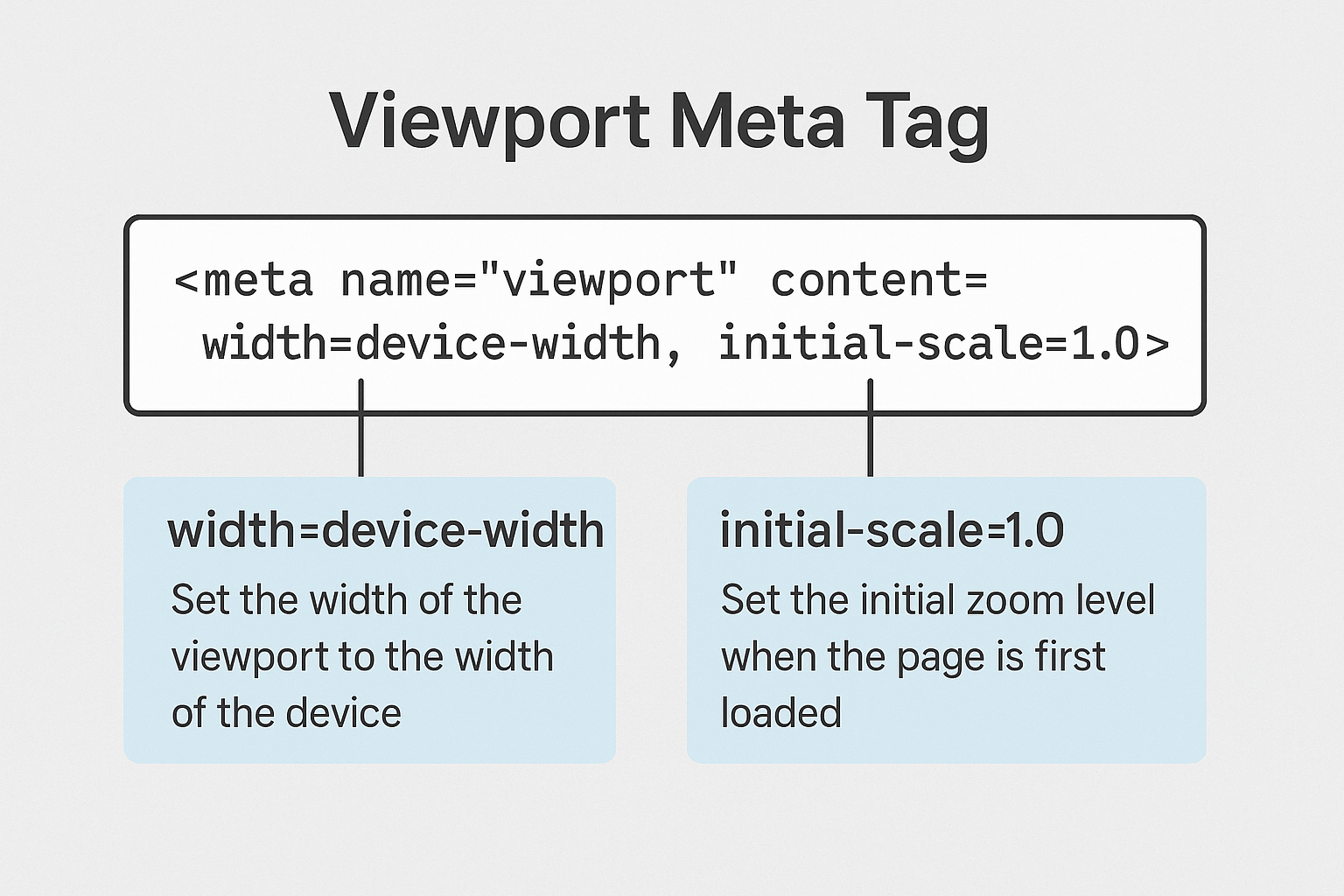
The viewport meta tag is an HTML tag that tells mobile browsers how to control the page’s dimensions and scaling. Without it, your site might display at full desktop width on a tiny screen — making everything look miniature and unreadable.
Here’s the recommended standard syntax:
<meta name="viewport" content="width=device-width, initial-scale=1.0">
This tag tells the browser:
- width=device-width – Match the screen’s width in device-independent pixels.
- initial-scale=1.0 – Set the initial zoom level to 1 (no zoom).
What Happens Without It?
When a website doesn’t include the viewport meta tag, mobile browsers assume the page was designed for a wide desktop screen. As a result, the browser shrinks the entire layout to fit within the screen — usually around 980 pixels wide — making everything tiny and hard to use.
Common symptoms include:
- ❌ Zoomed-out layout on phones
- ❌ Text and buttons too small to interact with
- ❌ Unnecessary horizontal scroll
- ❌ Higher bounce rate due to poor usability
Best Practices for Using the Viewport Tag
While adding the viewport tag is simple, it’s just as easy to get it wrong. Here are a few tips to make sure you’re using it properly:
- ✅ Use the recommended syntax:
<meta name="viewport" content="width=device-width, initial-scale=1.0"> - ❌ Avoid setting a fixed width:
width=980defeats the purpose of responsiveness. - ❌ Don’t disable zooming: Tags like
user-scalable=noormaximum-scale=1harm accessibility. - ✅ Keep it in the <head>: Place the meta tag near the top of your HTML for immediate effect.
Stick to the basics and you’ll be 90% of the way to a better mobile experience with just this one tag.
How to Check If Your Site Has the Viewport Meta Tag
You don’t need advanced tools or plugins to see if your site has this tag — a quick inspection will do.
Option 1: Use View Page Source
Right-click anywhere on your webpage and choose “View Page Source.” Then look near the top of the HTML for this line:
<meta name="viewport" content="width=device-width, initial-scale=1.0">
Option 2: Use Developer Tools
In Chrome or Firefox:
- Right-click on the page and click Inspect
- Go to the <head> section in the Elements panel
- Look for the
<meta name="viewport">tag
One Line of Code. A Much Better Experience.
Making your website mobile-friendly doesn’t always require a full redesign. Sometimes, a single HTML tag can solve your biggest usability issue.