
Ever wondered how your website looks and feels on a mobile device? Understanding how your visitors experience your site on their phones can dramatically improve usability and conversions.
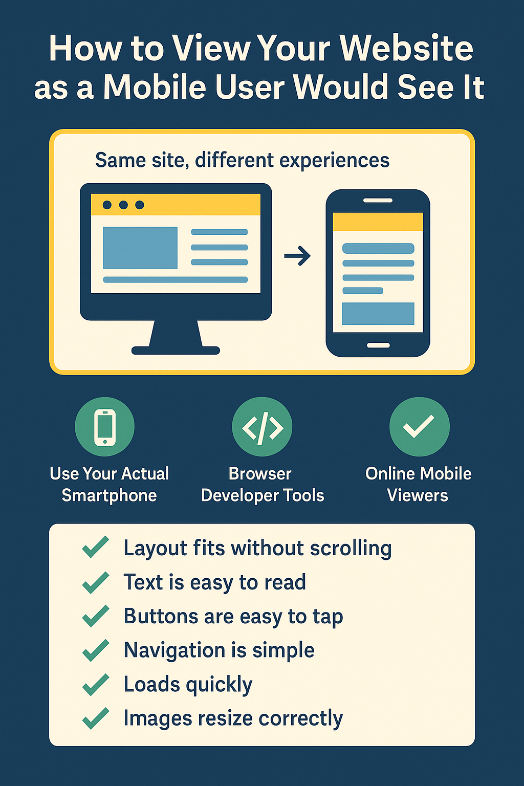
Why Checking Your Mobile View Matters
More people browse websites on smartphones than on any other device. If your site isn’t optimized for mobile, visitors could struggle with navigation, readability, and usability, ultimately impacting your business or brand. Regularly viewing your website from a mobile user’s perspective ensures you catch issues before they become real problems for your visitors.Easy Ways to See Your Site Through a Mobile User’s Eyes
You don’t necessarily need a developer’s toolkit to get an idea of your site’s mobile experience. Here are three straightforward methods you can use immediately:1. Use Your Actual Smartphone
The simplest method: open your website directly on your own smartphone. Browse it like a visitor would—checking navigation, readability, and overall ease-of-use.2. Browser Developer Tools
If you want a quick check from your desktop, use your browser’s built-in developer tools:- Chrome: Right-click your webpage → Inspect → Click the “Toggle Device Toolbar” icon.
- Firefox: Right-click your webpage → Inspect → Responsive Design Mode (Ctrl+Shift+M).
3. Online Mobile Viewers (No Setup Required)
If you’d rather avoid browser tools, simple online services can quickly show you a realistic mobile view. For example, our responsive test tool lets you instantly preview how your site looks on popular mobile devices, without any technical setup.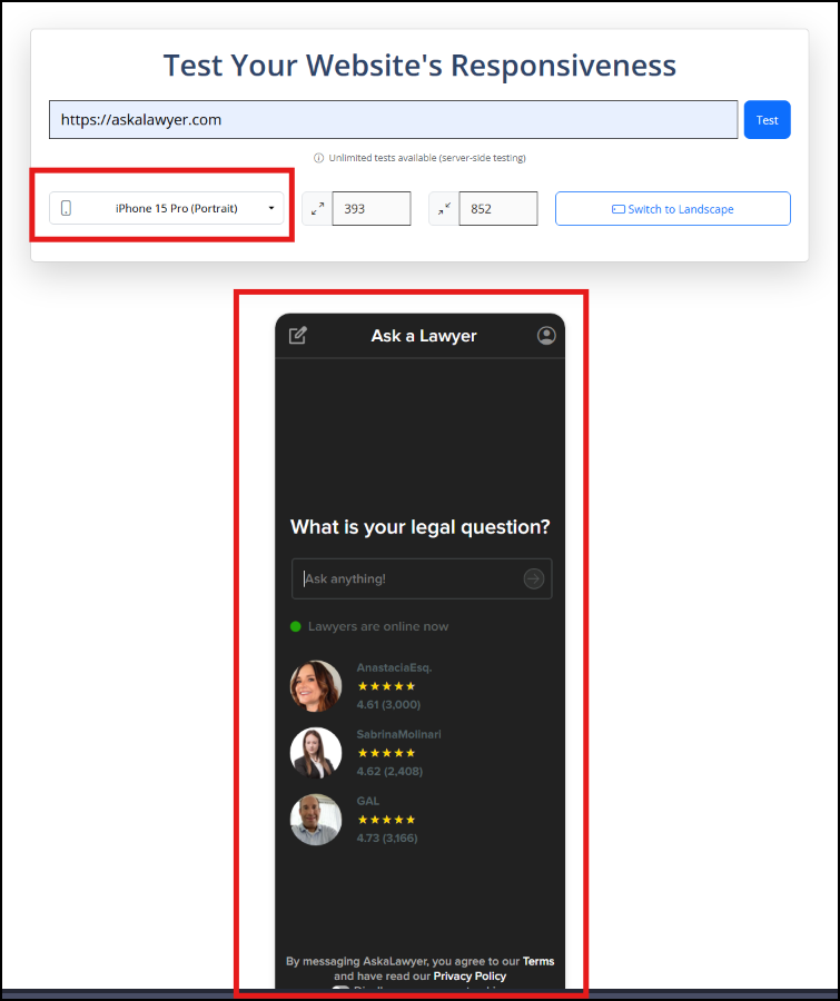
Tip: Whichever method you choose, regularly testing your site ensures you catch mobile layout issues early.
What to Check When Viewing Your Mobile Site
Simply seeing your site on a phone isn’t enough. Here’s what you should actively look for to ensure a smooth experience for your visitors:- ✅ Layout Fit: Does your content fit properly without side-scrolling?
- ✅ Text Size: Is the text large enough to read without zooming?
- ✅ Button and Link Spacing: Are clickable elements easy to tap without overlap?
- ✅ Navigation: Is the menu easy to find and use on a small screen?
- ✅ Load Speed: Does the site load quickly on mobile networks?
- ✅ Image Scaling: Do images resize correctly without breaking the layout?
Bonus Tips to Improve Mobile Usability
Once you’ve checked the basics, these extra steps can take your mobile experience to the next level:- ✅ Use the Viewport Meta Tag: Ensure you have
<meta name="viewport" content="width=device-width, initial-scale=1.0">in your HTML head section. - ✅ Leverage CSS Media Queries: Use media queries to adjust layouts and font sizes across screen sizes.
- ✅ Optimize Images: Compress and serve properly sized images to speed up load times on mobile data connections.
- ✅ Test on Real Devices: Simulators are helpful, but real-world devices can reveal issues that tools sometimes miss.
- ✅ Avoid Popups and Intrusive Elements: Full-screen popups can frustrate mobile users and violate Google’s mobile-friendly guidelines.
Start Thinking Like Your Mobile Visitors
Becoming truly mobile-friendly starts by seeing your website the way your visitors do. Whether you use real devices, browser tools, or online mobile viewers, regularly testing your site helps you catch problems early and deliver a better experience for every user — no matter what screen they’re on.