
Being mobile-friendly means more than just shrinking your site. It means your layout, text, images, and interactions adapt to fit every screen — and CSS media queries are the key to making that happen.
Why Mobile-Friendly Design Starts With CSS
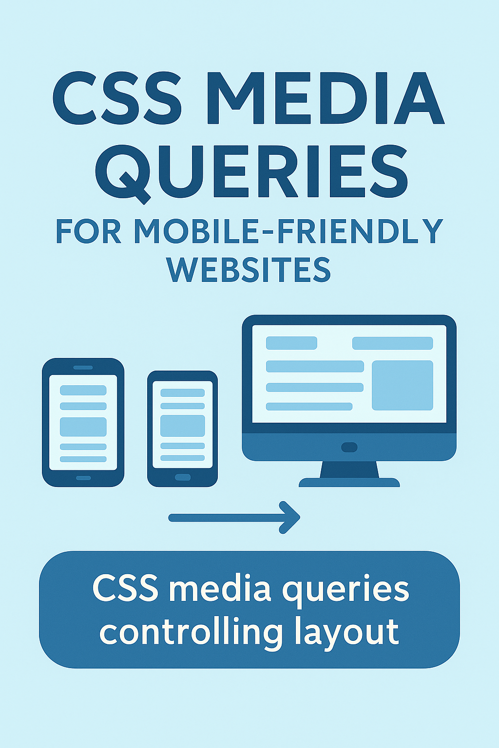
Today, most people will visit your website on a mobile device first. If your layout isn’t built to adapt, you risk frustrating visitors with tiny text, broken layouts, or endless horizontal scrolling.
While the viewport meta tag sets the stage for mobile scaling, CSS media queries control how your design actually responds as screen sizes change. Without them, true mobile-friendliness simply isn’t possible.
What Are CSS Media Queries?
Media queries are a feature in CSS that allow your website’s design to adapt based on the user’s screen size, resolution, orientation, or even device capabilities. They work by applying different styles depending on conditions you set.
In simple terms: media queries let you write rules like, “If the screen is smaller than 768 pixels, use this layout instead.”
That flexibility is what allows one website to look great on both a wide desktop monitor and a narrow smartphone screen — without needing separate versions of your site.
Basic Syntax of a Media Query
Media queries follow a simple structure: you define a condition, and if that condition is true, the styles inside will be applied.
@media (condition) { ... CSS rules ... }
For example, here’s a basic rule that changes the font size for screens narrower than 768 pixels:
@media (max-width: 768px) {
  body {
    font-size: 16px;
  }
}
In this example:
- max-width: 768px means “only apply these styles if the screen is 768 pixels wide or smaller.”
- body { font-size: 16px } increases text size for better readability on smaller screens.
Common Breakpoints for Responsive Design
While every project is different, developers often use a few common breakpoints to handle popular device sizes. Here are some widely used examples:
| Device Type | Breakpoint Range | Example Media Query |
|---|---|---|
| Small Phones | Up to 480px | @media (max-width: 480px) |
| Tablets (Portrait) | 481px – 768px | @media (max-width: 768px) |
| Tablets (Landscape) | 769px – 1024px | @media (max-width: 1024px) |
| Small Laptops | 1025px – 1200px | @media (max-width: 1200px) |
| Desktops | 1201px and up | @media (min-width: 1201px) |
Remember: these are not strict rules — they’re just helpful starting points. Test your site across real devices and adjust as needed.
Writing Good Mobile-First Media Queries
The best practice today is to build your website mobile-first — meaning you design for smaller screens first, then layer on additional styles for larger screens as needed. This approach keeps your code cleaner and ensures smaller devices aren’t overloaded with unnecessary styles.
Here’s how a mobile-first media query typically looks:
/* Base styles for mobile */
body {
  font-size: 16px;
  padding: 20px;
}

/* Styles for tablets and up */
@media (min-width: 768px) {
  body {
    font-size: 18px;
    padding: 40px;
  }
}
Key tips for writing better media queries:
- ✅ Start with the smallest screen first, then build upward.
- ✅ Use
min-widthinstead ofmax-widthto follow mobile-first logic. - ✅ Avoid hardcoded pixel widths inside your layout — let elements grow and shrink naturally using percentages, flexbox, or grid.
- ✅ Test your breakpoints on real devices, not just emulators.
Combining Media Queries with Other Responsive Techniques
Media queries handle when your styles change — but they work best when combined with other responsive design techniques that handle how your content adapts.
- Viewport Meta Tag: Always include
<meta name="viewport" content="width=device-width, initial-scale=1.0">to let mobile devices scale properly. - Flexible Grids & Layouts: Use percentage-based widths, CSS Grid, or Flexbox to let elements naturally resize as the screen grows or shrinks.
- Responsive Images: Use
max-width: 100%on images or implementsrcsetto serve appropriately sized images to different devices. - Fluid Typography: Use scalable font sizes that adjust with screen width using techniques like
clamp()orvwunits.
When all these pieces work together, your design feels natural on any screen — whether it’s a small phone or a wide 4K monitor.
Media Queries Are at the Core of Mobile-Friendly Design
Creating a mobile-friendly website isn’t just about shrinking content to fit smaller screens. It’s about designing layouts that respond to users wherever they are, on whatever device they’re using. CSS media queries give you the control to adapt, enhance, and optimize your design across the full range of screen sizes — from phones to desktops and everything in between.