In 2025, over 60% of web traffic comes from mobile devices. If your website isn’t responsive, it’s not just a bad user experience — it’s hurting your SEO, conversions, and brand credibility.
This guide will show you how to test your website’s responsiveness using ResponsiveWebTest.com, a free and powerful tool for modern web testing.
What Is Responsive Web Design?
- Adapts content layout to fit any screen
- No horizontal scroll
- Scales text and images smoothly
- Improves accessibility and mobile SEO
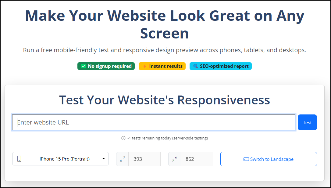
How to Test Your Site with ResponsiveWebTest.com
Step 1: Enter Your URL
Go to ResponsiveWebTest.com and type your website address.
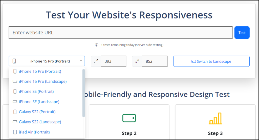
Step 2: Select Device
Choose from real devices or input custom dimensions.
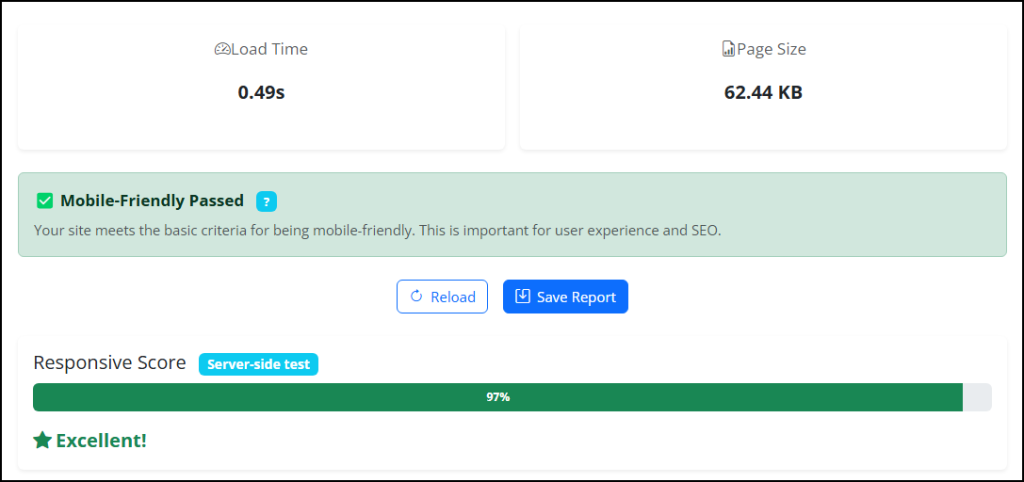
Understanding the Responsive Score
ResponsiveWebTest gives you a visual score (0–100) based on:
- Viewport meta tag detection
- Media queries implementation
- Content width matching device
- No horizontal scroll on smaller screens
It also shows a performance snapshot with load time, page size, and request count — helping you optimize both speed and layout.
How to Fix Common Mobile Responsiveness Issues
<meta name="viewport" content="width=device-width, initial-scale=1.0">
This tag ensures your site scales properly on mobile devices.
<img src="image.jpg" class="img-fluid" alt="Responsive image">
<div style="width: 600px">Good:
<div style="max-width: 100%"> or use Bootstrap’s grid system.
Why This Affects SEO
Google prioritizes mobile-first indexing. If your website fails on mobile devices, it can seriously impact your visibility in search engines.
ResponsiveWebTest’s mobile-friendly badge and checklist make it easy to diagnose issues that hurt rankings.
✅ Test Your Website’s Responsiveness Now
Enter your URL and see how your site performs on real devices — no signup needed.
Run a Free Test